Hannah Bakes
Hannah Bakes is a small bakery brand built around warmth, care, and handmade quality. For this project, the goal was to design a logo that reflects not just baked goods, but also the love and passion behind them.
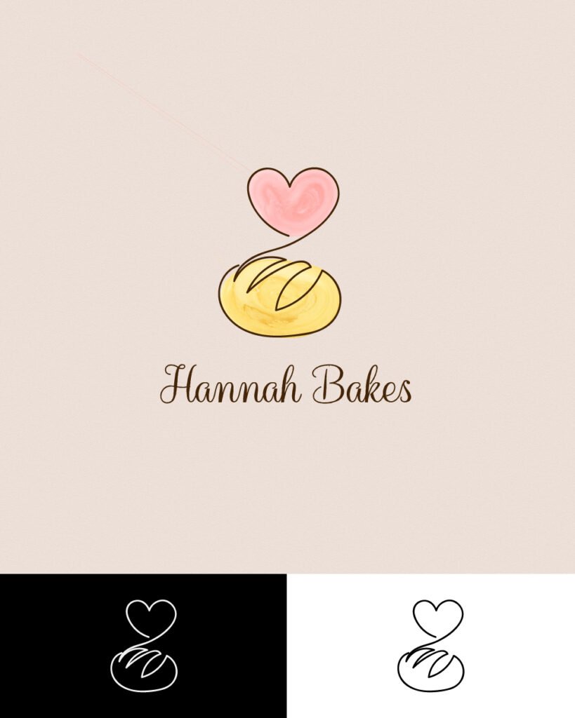
Concept
The logo combines two core elements: a golden loaf of bread and a heart. The bread represents the product itself—fresh, handmade, and wholesome. The heart element symbolizes love, warmth, and the emotional connection customers have with home-baked goods. Together, they form a mark that feels friendly, personal, and inviting.
Visual Identity
The main logo uses soft pastel colors with a warm brown script typeface that feels approachable and handcrafted. For versatility, the identity also includes monochrome versions in black and white, making the logo adaptable for packaging, signage, and social media use.
The Result
The Hannah Bakes logo captures the essence of homemade baking: comfort, love, and quality. It creates an approachable and memorable brand identity that customers can instantly connect with, whether on packaging, promotional materials, or digital platforms.
Start Your Project
Answer a few quick questions so I can scope your project and give you a clear plan. Pick the brief that fits.
Logo Design Brief
A focused questionnaire to define your brand style, goals, and preferences, so your logo is memorable and on-point.
Website Project Brief
Outline your site goals, pages, and features. I’ll turn your answers into a roadmap and quote.